

online winkel
Reserveringen
events
pop-up

MegaMenu Pro
Door
A mega menu with pictures from your categories
Nog geen beoordelingen
14 dagen gratis uitproberen

MegaMenu Pro overzicht
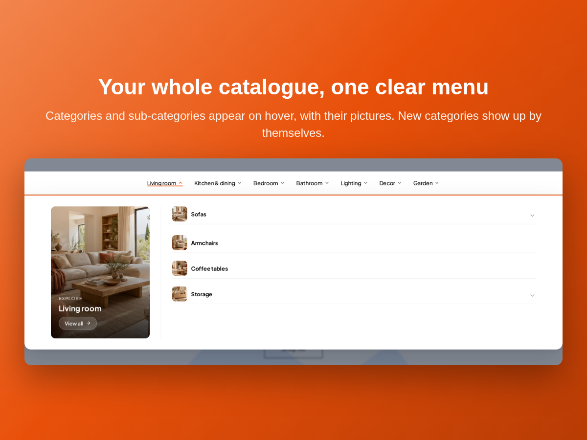
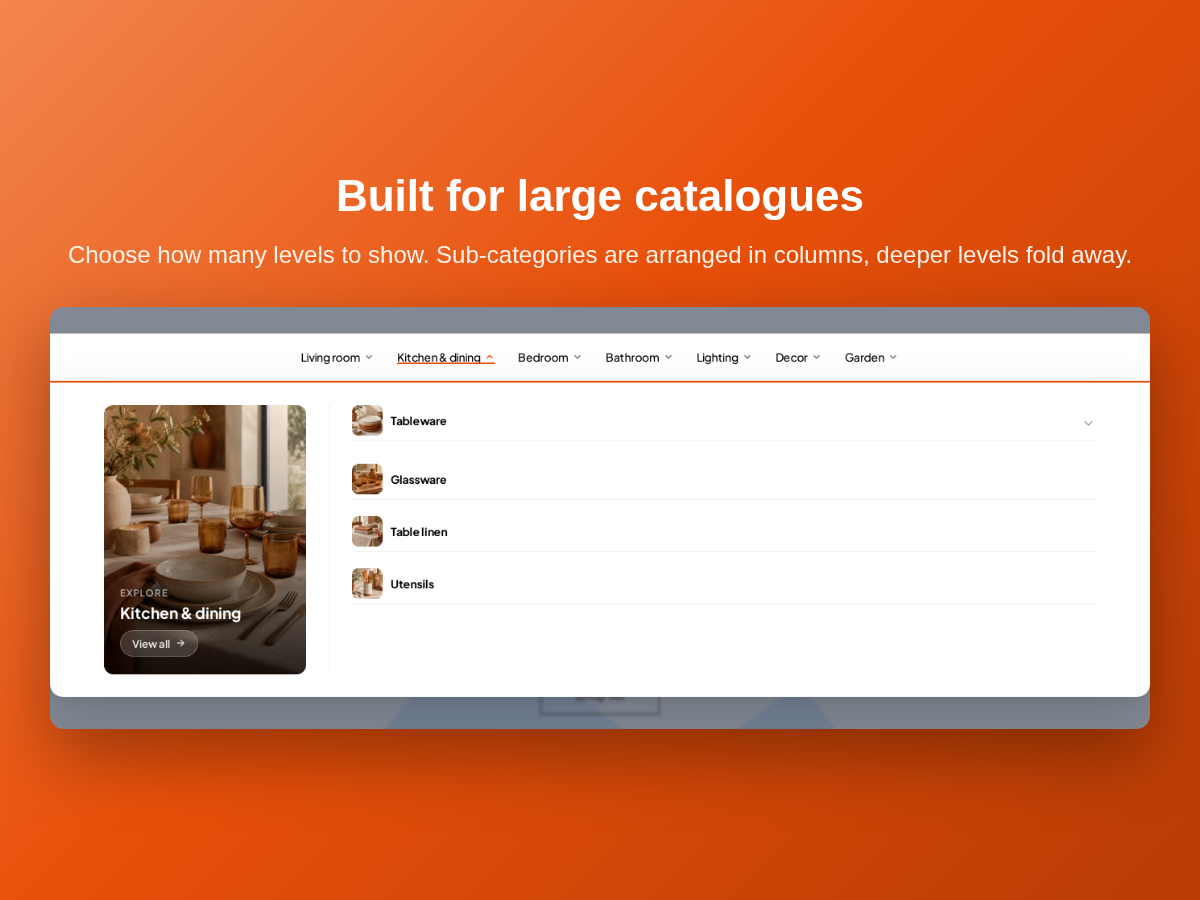
- Mega menu built from your store categories, on as many levels as you choose
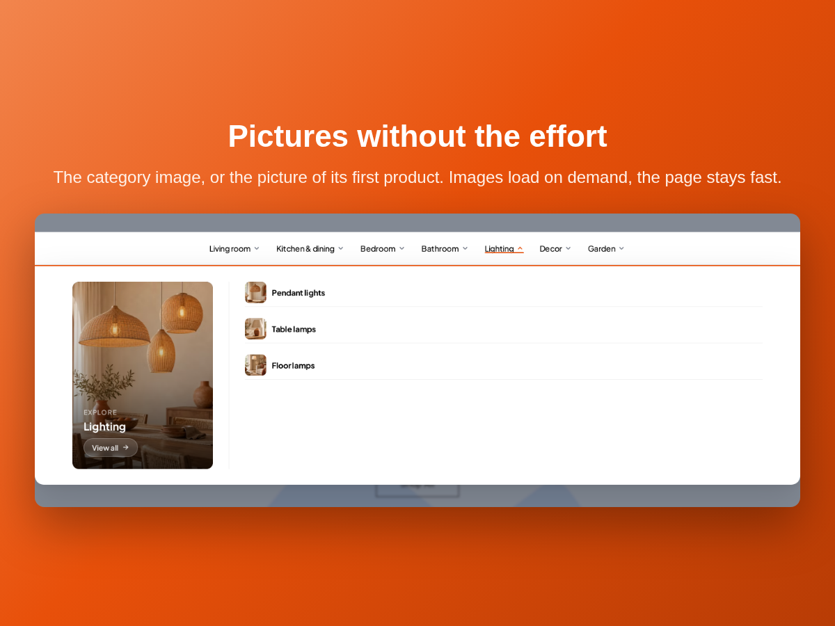
- Category pictures or first product photos, with a library, own images and badges
- Show or hide a category with one click, saved at once
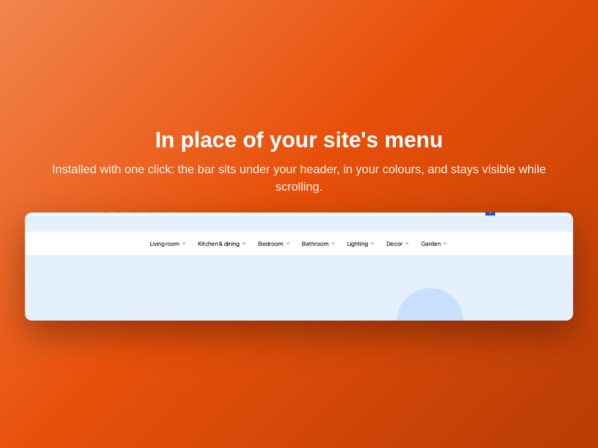
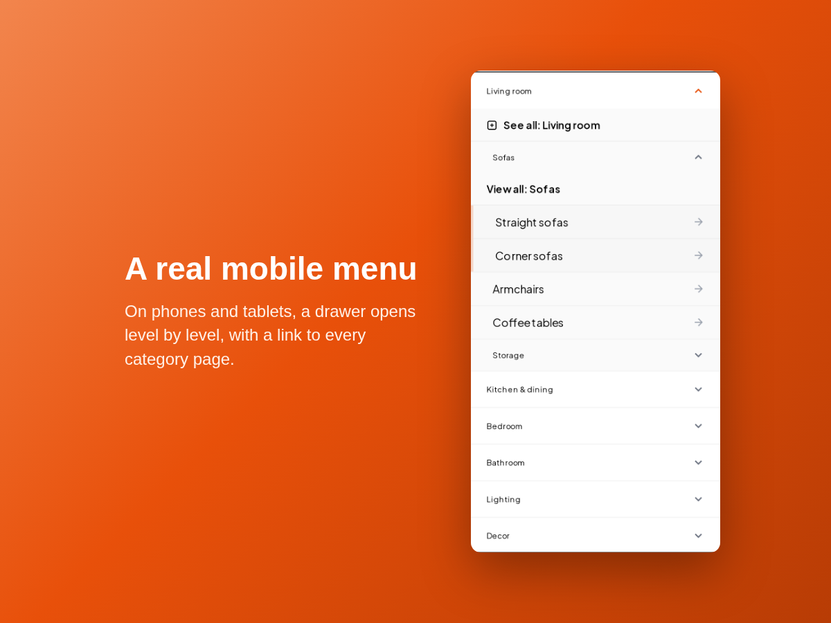
- Your colours, sticky bar and a drawer menu on mobile
Beoordeling
Deze app heeft nog geen beoordelingen ontvangen, wees de eerste om hem te beoordelen.Prijzen en abonnementen
Deze app biedt een gratis proefperiode van 14 dagen aanPro-abonnement
$
4
08
/maand
All features, nothing held back
Menu built from your store categories
Category pictures, badges and colors
Mobile drawer menu included
* De prijs is in USD.