Nederlands
Klantenservice
Ga naar Wix.com
Inloggen
The Foxsy Designs
Branding • Web Design • SEO + AI Strategy
0
Voltooid project
Geen beoordelingen
Contact opnemen
Diensten
SEO-diensten
Geschreven inhoud
Optimalisatie webshop
+ nog 16
SEO-diensten
Geschreven inhoud
+ nog 17
Klantprojecten
Over
Dr. Gina Witt | ITA Energy Medicine
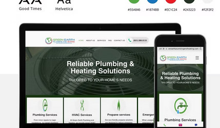
Green Earth
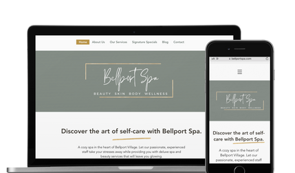
Bellport Spa
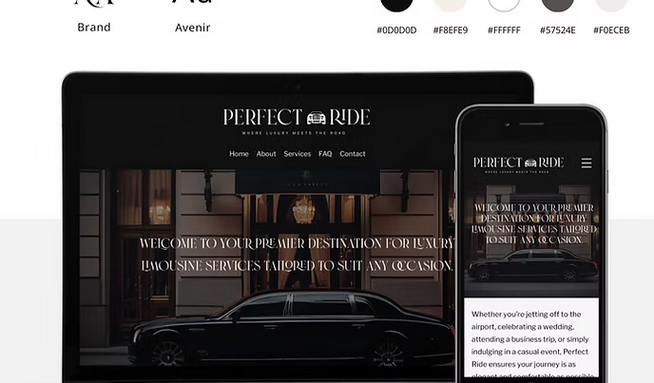
Perfect Ride LLC
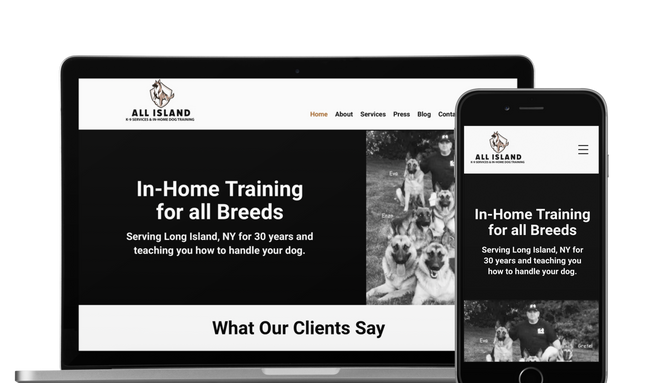
All Island K9 Services